Data Quality
A Business Data Owner or Director of Data Governance can view the Data Quality Dashboard to evaluate the quality of data and drill down into areas of data quality concern.
The dashboard and charts only allow access to detail data to which the logged in user has access. Refer to Configure User Settings, Reports and Filters for more information about setting up user access.
To use the Data Quality Dashboard:
View Data Quality Dashboard
The overview area of the Data Quality Dashboard displays a doughnut chart with the overall data quality score across all reports as well as charts that show the data quality score for each of the seven industry standard quality dimensions delivered with Data Quality.
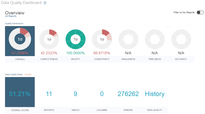
Data Quality Dashboard — Initial Overview View
The dashboard filter option (Filter on My Reports) filters the dashboards to show data based on the reports to which the logged in user has access or all reports. A user can only drill-down to view report data to which they have been granted access. Refer to Configure User Settings, Reports and Filters for more information about setting up user access.
Each segment on a chart represents one sigma level. There are seven levels. A fully shaded segment represents the completion of a level, a partially shaded segment represents a partial completion of a level, and a blank segment represents a level not fully or partially completed. The sigma level displays inside the charts if the Enable Sigma Level checkbox is checked on the Data Quality Scoring Threshold section of the Metric Parameters tab on the Parameters page.
The colors of the segments are based on data quality score thresholds, which define the status assigned to an object being scored when the percentage of defects falls below the threshold. Statuses are Red (critical), Yellow (warning) and Green. Refer to Register Data Quality Score Thresholds for more information about status and thresholds.
NOTE: The dashboard is dynamic, as the user clicks options on the dashboard the data displayed is updated according to context. The label above the overall charts and overall scores displays the current context.
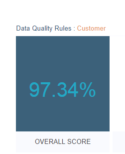
Overall Score — Context Label
View the Dashboard Detail Row
Click a chart in the overview row to update the detail row to display:
- The reports, tables, and columns that make up the chart score
- The counts for each quality dimension
- The number of errors associated with the selected context
- A History option
Click the History option to display the Chart Histogram in a new browser tab. Refer to View Chart Histogram for more information.
Click an item in the detail row to open a new browser tab that displays the summary reports page, Your Group Reports, Your Object Reports or Your Application Reports, depending on the context selected, for the report, table, or column included in the count.

Detail Row
View Scores for a Category
A user can click an overview chart to display a summary row to view the data quality scores for a category, Groups, Objects, and Applications for the overall chart and for each quality dimension chart.
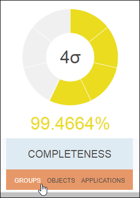
Overall Chart — Options
To view charts for a category:
- Click Data Quality Dashboard in the Navigation pane.
- Hover a cursor over a chart label on the overall chart or a quality dimension chart.
- Click Groups, Objects, or Applications.
The summary row displays the data quality score for the category selected. Charts representing data quality scores for each element in the category display. The number of reports, tables, columns, and errors that are included in the current score for the element display in the detail row.
Click an element chart in the summary row to update the detail row. As with the detail row for the overview row, click the label in the detail row to open a new browser tab that displays the report, table, or column included in the count.

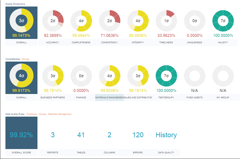
Data Quality Dashboard — Summary Row
View Scores for all Elements in a Category across Quality Dimensions
Click Refocus Dashboard on the overall chart in the summary row to pivot the Data Quality Dashboard page to display the data quality score for all elements in a category across quality dimensions. In this view, clicking the chart updates the detail row and clicking a label in the detail row opens a new browser tab that displays the report, table, or column included in the count.
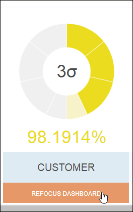
Overall Chart Summary Row — Refocus Option
Hover a cursor over a chart label and click Dimensions to display a summary row to view data quality scores for the quality dimensions for an element. Click a chart in the summary row to update the detail row.
To return to the main Data Quality Dashboard page, click the X next to the context label.
View Scores for Quality Dimensions within an Element
Click Refocus Dashboard on a summary row chart to pivot the Data Quality Dashboard page to display the data quality score for quality dimensions within the element selected.
In this view, clicking the chart updates the detail row and clicking a label in the detail row opens a new browser tab that displays the report, table or column included in the count.
To return to the main Data Quality Dashboard page, click the X next to the context label.
View Chart Histogram
The detail row for each context available on the Data Quality Dashboard page has a History option that opens a new browser tab with a Chart Histogram that shows the history of data quality scores for the context selected.
The bar chart displays the current month to date, and the previous six months of history of the data quality scores based on the context selected.
Hover a cursor over a data point on the line to view the number of reports included in the score for the month.
The View Data icon to the right of a chart name opens a pane that displays the alternate text descriptions of chart data in a table.
To view the Chart Histogram:
- Click DQS Dashboard in the Navigation pane.
- Click the History option in any detail row.
NOTE: The detail rows are updated dynamically when a user selects a particular chart and context on the Data Quality Dashboard page. The Chart Histogram labels show the context being viewed.
